ETOLL
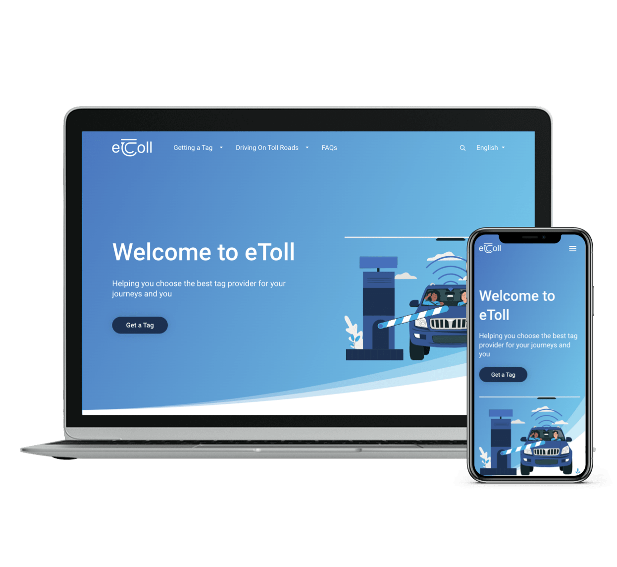
We redesigned eToll’s corporate website together with Indra
We have worked hand in hand with Indra in the redesign and development of the eToll website, the Irish interoperability system for toll roads. Usability and visual elements have been the main protagonists.
The challenge
Our main objective: to improve usability, accessibility, performance and positioning with a design adapted to its corporate image and user expectations.
The design: the main protagonist
The changes were focused on providing eToll with a more modern corporate image and facilitating navigation through the web, improving the user experience.
Our UX/UI design team has played a key role in the development, as the prototype, in addition to the aesthetic part, established all the functional keys of the platform, thus guiding the development.
We did not receive any indications or preferences regarding the design, so we had the freedom to establish the new style

Blanca Salgado
UX/UI Manager
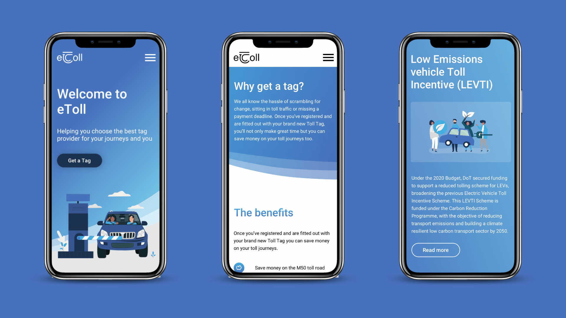
More visual interaction
The previous website showed all the content in text. We have decided to segment it to give each section its space and importance and make it more visual and accessible.
Accordions
Banners
CTA Buttons
Logos
Illustrations
Bullet lists
Custom illustrations
We have individually treated each of the illustrations, adapting them to achieve a unified and representative design of eToll.
Coherent design
We consider details of the market to which the website is directed, such as the fact that in Ireland the driver is on the right side of the vehicle. All this has been represented through the icons and illustrations designed.
UX/UI Design
After an analysis of the requirements, several meetings with the client and the team and based on our experience, we proposed three designs, with approaches adapted to their corporate image, but with very different approaches
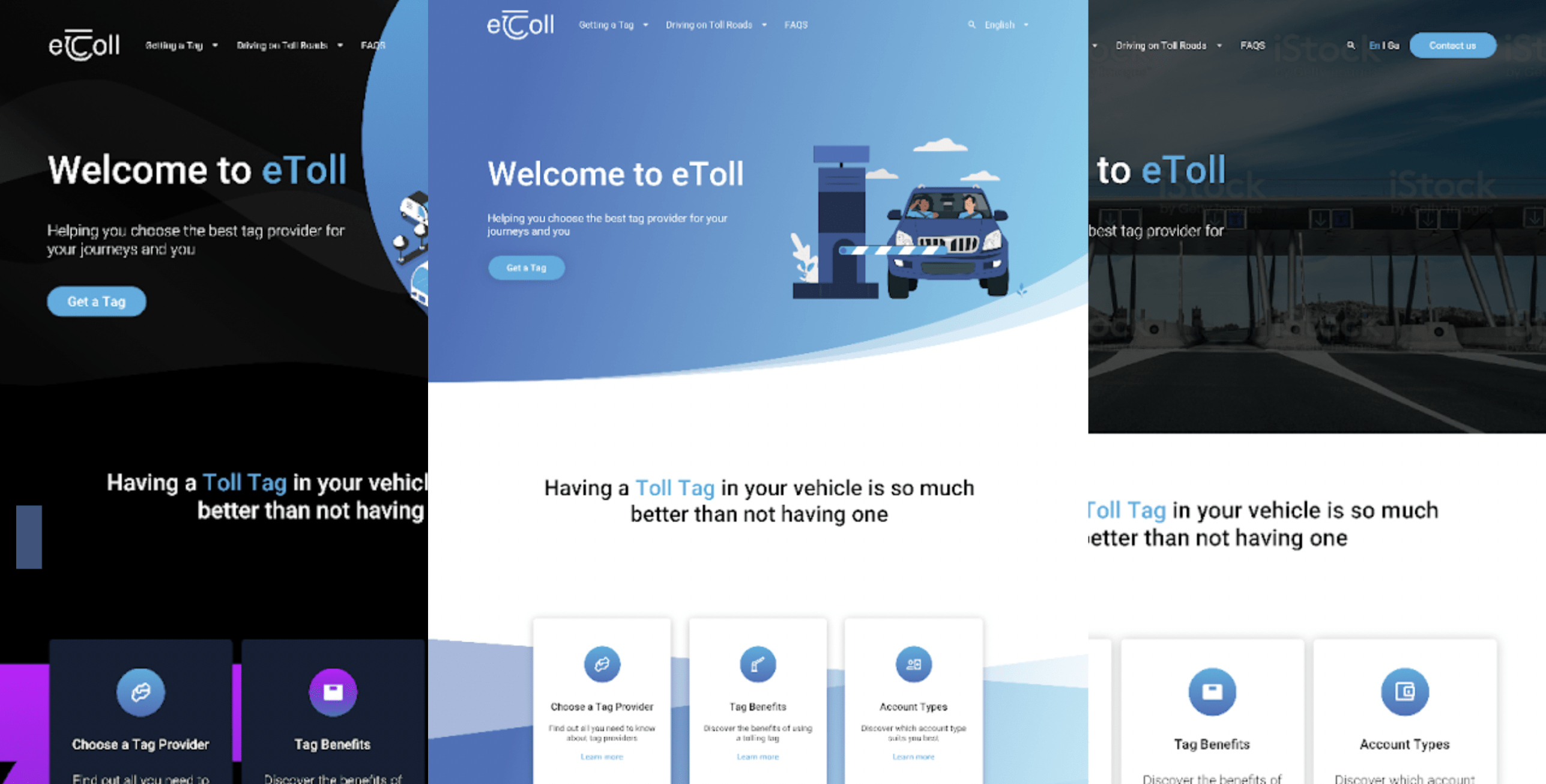
A first, more risky design with darker tones
A second, somewhat more relaxed design but with attractive visual elements
A third, simpler and more conservative design
Development and programming in WordPress
Once the design and functional requirements approved by the client were clear, the development team was able to start working on the website, developed on WordPress.
The selection of a CMS as well-known and versatile as WordPress is one of the most recommended for corporate websites, as has been the case with eToll.
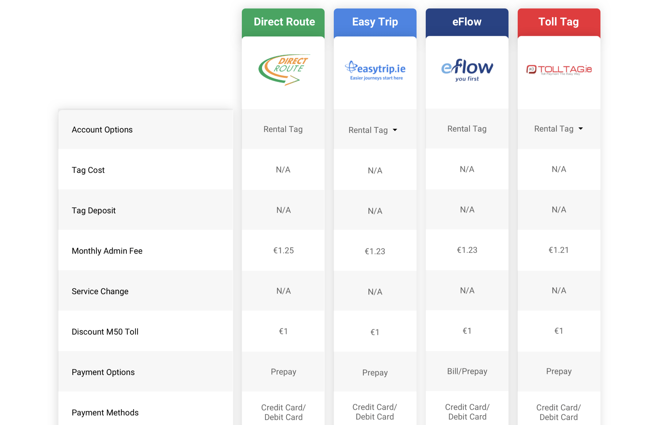
We worked both on individual pages and on generic components, reusable in different parts of the platform.
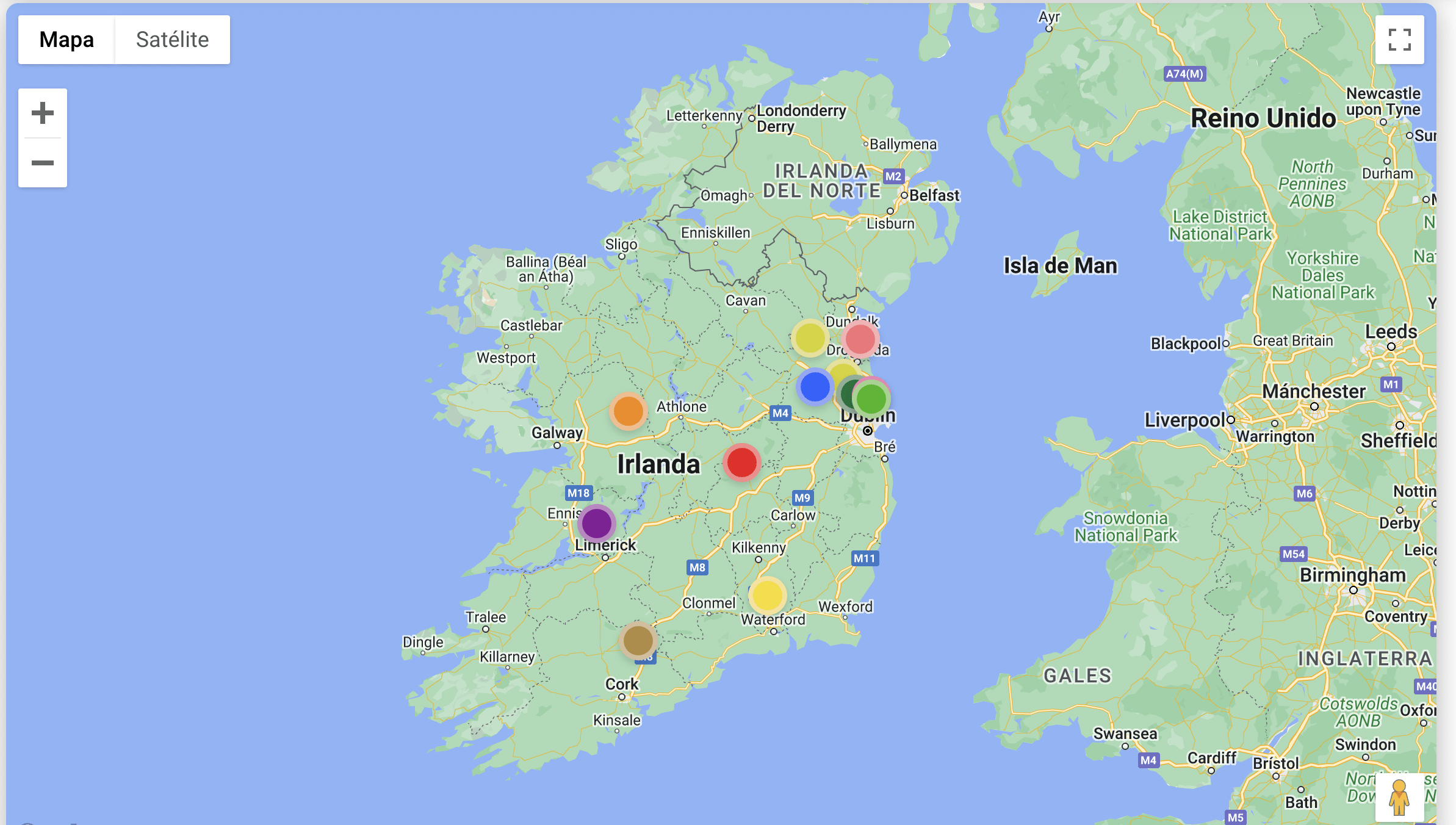
We highlight developments such as the Tag Providers cards, with a random operation, or the toll road map, which includes interactive points to obtain more information.
Quality review
At the beginning of the project, a testing plan was established, establishing the functional, accessibility and aesthetic quality requirements that the platform had to meet in order to be launched.

Continuous testing cycles from the development of the first screen.
Reporting of incidents and improvements with a Kanban board.
Real-time communication between the testing and development teams.
The result
The result is a completely renovated corporate website, with an image adapted to its target audience and, above all, with a focus on usability.
Users will be able to find the necessary information on the website much faster and more pleasantly, with a clear and intuitive structure.
For the eToll teams, this means simplifying their work when contributing or modifying content. The developed components as well as the simplicity of WordPress are key to this end.

Shall we talk?
If you need to develop or improve your digital business, count on us. You can write us an email at hello@digital55.com, call us at +34 913 091 641 or fill out the form below.


